iPhone 5c review
iPhone 5c review:-
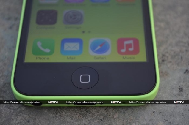
The release of iPhone 5s and iPhone 5c in September last year marked a departure from Apple's usual strategy of releasing one new iPhone every a year. The launch of the new iPhone would be accompanied by the outgoing iPhone getting a price cut, and the one before that becoming free on a contract in certain markets. This approach served Apple well because the iPhone doesn't age as quickly as its Android counterparts, and even a generation-old iPhone competes favourably with most mid-range Android phones on performance, if not on price.
This strategy was not without its flaws as many people felt uncomfortable buying 'a one year old phone'. While most non-flagship phones from other manufacturers run on hardware that's anywhere between one and several years old, it seems that as long as the outer package is refreshed and given a new name, you can avoid the criticism that comes with trying to sell an 'old' phone.
By releasing the iPhone 5c, which sports a brand new look, but has near identical specs as the now discontinued iPhone 5, Apple seems to have take a leaf out of the book of its competitors. So is the iPhone 5c just old wine in a new bottle, or is it another winner from Apple - let's find out.
(Also see: iPhone 5c vs. iPhone 5)
Build/ Design
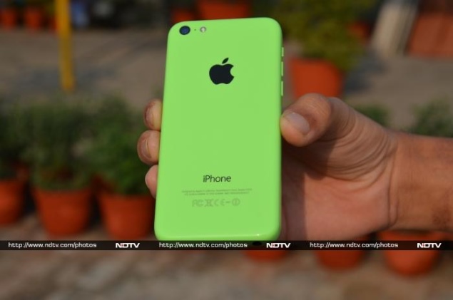 The iPhone 5c is of course "unapologetically plastic", as Jony Ive called it in the introductory video showcased at Apple's developers conference. While this move surprised a few, it is worth remembering that iPhone 5c is not the first iPhone to come with a plastic body. The original iPhone-761) came with a body that used both plastic and glass, as did the iPhone 3G, and of course theiPhone 3GS. The metallic chassis seen in recent iPhone models didn't make an appearance until theiPhone 4.
We have to admit that having been spoilt by the great in-hand feel of successive iPhone models since the iPhone 4, we were initially sceptical about the plastic iPhone 5c. However, that changed when we held the new iPhone in our hand for the first time. iPhone 5c's plastic body comes with a steel reinforced frame inside that gives it a rigidity not usually associated with plastic bodies. The plastic itself is as good as what we've seen used on a phone, and in terms of overall fit and finish, the iPhone 5c compares favourably with flagship Lumia devices from Nokia.
One key difference between the iPhone 5c and Lumia devices of course is that while Apple has gone with a glossy finish for all its colours - Green, Blue, Yellow, Pink, and White - Lumia devices are available in both glossy and matte finishes. Apple is clearly trying to appeal to a younger crowd by going with a glossy finish on the iPhone 5c and though the result is better than the glossy-finished Lumia devices, we'd pick the matte-finished Lumia devices over either, but that's a personal choice.
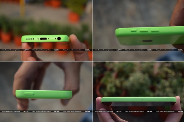
The iPhone 5c (124.40 x 59.20 x 8.97 mm, 132 grams) is slightly bigger and noticeably heavier than the iPhone 5 (123.80 x 58.60 x 7.60 mm, 112 grams). While we don't like the idea of moving to a heavier phone, some people found the overall feel of the iPhone 5c better than the iPhone 5. It's safe to say, as solid as the iPhone 5c feels, we prefer the metallic chassis and the lightness of the iPhone 5 and the iPhone 5s.
Display
The iPhone 5c sports the same 4.0-inch 640x1136 seen in the iPhone 5 and the iPhone 5s. Yes, that display feels small in a world full of Android flagships around the 5.0-inch mark, and other even bigger devices that push the definition of the words phone and, indeed the bastardisation that is phablet. While the likes of Nokia and BlackBerry have realised the importance of having large screen offerings in the form of the Lumia 1520 and the BlackBerry Z30 respectively, Apple, rather obstinately some believe, continues to hold out. It is expected Apple will change that by finally releasing a bigger iPhone in 2014, though of course there's nothing even remotely official about that statement. Until then, if you want the iOS experience, you can choose between the 3.5-inch screen of the iPhone 4S or the 4.0-inch display that iPhone 5c and iPhone 5s offer.
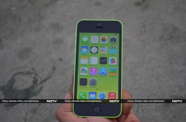
As far as the performance is concerned, with the naked eye you'll struggle to notice any difference when compared to iPhone 5's display. You'll notice this theme throughout the review, as the iPhone 5c and iPhone 5 boast near identical internals. While the display may fall short on specs compared to full-HD smartphones in the wild, the colour reproduction is excellent, sunlight legibility is good and viewing angles are great.
iOS 7
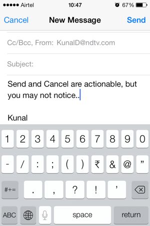 iPhone 5c comes with iOS 7 out of the box. iOS 7 is a visual overhaul of Apple's mobile operating system that puts whitespace and typography in focus, while underplaying skeuomorphic design elements (ones that resemble real world objects). This means that buttons that have traditionally been used in UI design to indicate actionable objects, have been given way to free hanging text.
While we are glad to see some skeuomorphic elements like stitched leather in Calendar app giving away to a simpler design, we are not convinced that getting rid of buttons is a step in the right direction. Apple has acknowledged some of this criticism, with the final iOS 7.0 release scaling back some of the more radical changes, and re-introducing some skeuomorphic elements.
The new look also brings in new UI and icons for Apple's apps like Mail, Safari, App Store, Calendar and others. The colourful new icons complement the iPhone 5c rather well, and in that sense the new OS feels more at home on the 5c instead of the flagship iPhone 5s.
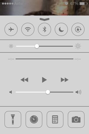 iOS 7, though, is not just about the visual changes, it brings in several new features as well. Perhaps the biggest addition is Control Center, that can be invoked by swiping up from any screen, including (optionally) the lock screen. Control Center lets you quickly toggle Airplane Mode, Wi-Fi, Bluetooth, Do Not Disturb , Orientation lock and Flashlight. You can also adjust the brightness and volume, or control the music. Also included are shortcuts to quickly set an alarm and to invoke the Calculator and Camera apps.
Sadly, there's no way to customise these shortcuts to include your favourite apps. We also wish there was a way to toggle 3G and/ or Cellular Data, as we find ourselves reaching for that control way more often than, say, Airplane Mode. Despite these shortcomings, it's good to see Control Center finally coming to iOS, especially since similar functionality has been available on Android forever.
Notification Center has been revamped to include aToday view that gives an overview of the day including upcoming appointments and a Tomorrow view that gives a quick summary of the next day. You can customise the view to show other elements like Stocks, Reminders and more. The Missed view lists notifications from the last 24 hours, while All shows all notifications you haven't interacted with (or cleared) yet. The overall look and feel of Notification Center has been changed to be more iOS 7-like, and though you can interact with some notifications (depending upon the application that generated the notification), the experience is still very limited compared to Android that has a more feature-rich notifications system.
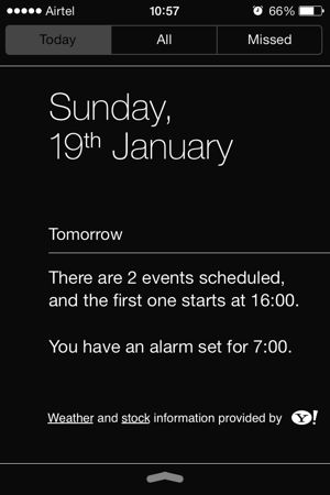
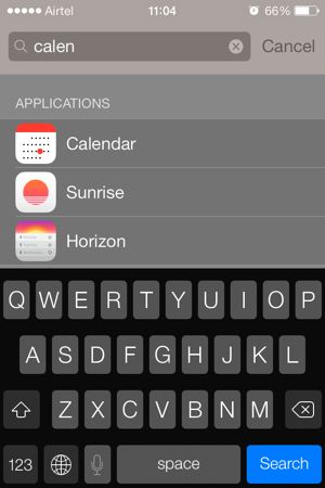
 As always, you can bring the Notification Center by swiping down from the top edge on any screen, including (optionally) the lock screen. However, you can no longer swipe left (or press home button) while on the first home screen to bring up universal search. Instead, swiping down from the middle of any home screen brings a search box that works just like the old universal search.
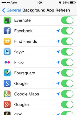 iOS 7 also brings support for Background App Refresh - enabled for all apps by default - that lets you control what apps can update their data while running in the background. Apple has put its twist by analysing your usage habits to optimise the process. So if you tend to open Facebook app first thing in the morning, you can expect to have the News Feed refreshed when you switch to the app. Similarly, if you don't use an app for a few weeks, you can expect iOS not to devote resources to the app in the background. While this sounds like a great idea on paper, it's a little difficult to ascertain how well (or otherwise) this technology is working, as most apps tend to refresh their data again once you switch to them.
iOS 7 finally bridges the gap on Android in another key aspect by bringing in support for automatic updates. You can choose to have the apps updated automatically over Wi-Fi only, over Wi-Fi and cellular data, or not at all. We recommend having it set to the first option, though we found ourselves missing Android's ability to control update behaviour of individual apps, which is especially handy if you want to keep certain apps at a specific version, while auto-updating the others, or save bandwidth by having only your favourite apps update automatically.
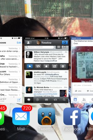
Double tapping the Home button no longer brings a grid of boring icons that you could tap and hold to reveal the 'kill button'. What you get instead is an interface that is reminiscent of the erstwhile webOS where all open apps are shown with card-like views of the app's last running state (or its closest approximation). You can slide left or right to reveal more apps, or swipe up a card to kill that app.
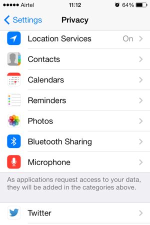
 iOS 7 brings enhanced Privacy Controls, with the ability to control (and easily see an overview of) which apps have access to location data, contacts, calendars, reminders, photos, Bluetooth sharing and the microphone. You can also control what apps can access your system-wide Facebook and Twitter. Contrast this with Android's all-or-nothing approach, that tells you what data an app will access before you install it, but there's nothing you can do to control that, other than not installing the app at all.
As we mentioned before, all of Apple's apps have been redesigned for iOS 7, with some adding new features to go along with the refreshed look. Safari gets a new way of handling tabs that makes it easier to switch between tabs on your iPhone and other iCloud-enabled devices by simply swiping up and down. 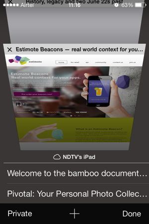 The browser is no longer limited to eight tabs and we've had multiple dozens of tabs open on our iPhone (it's a disease, we know) without hitting a limit (that's not to say there isn't one, we just didn't hit that number). The address bar and search box have been combined into a unified 'smart search' field. Safari also adds Shared Links that lets you see all the URLs in your Twitter timeline at one place, which sounds like a good idea on paper, but we didn't find ourselves using it at all.
Perhaps our favourite Safari-related feature is iCloud Keychains, which lets you sync usernames, passwords and credit card information across various Apple devices. Enter your username and password once for a website (on your Mac or iOS device) and iCloud will offer to remember it for you. The next time you visit the website on another iCloud-enabled device, the username and password fields will be automatically filled. iCloud even suggests strong passwords when you are signing up on a new website.
Apple now offers six of its apps - iPhoto, iMovie, GarageBand, Pages, Numbers, and Keynote - for free to all new iOS and Mac users. You'll get the option to download these apps while setting up the device, or you can choose to download them at a later stage. Together, the six apps give every iOS user a powerful suite for managing photos, editing movies, recording music, and creating documents, spreadsheets and presentations.
Other iOS 7 changes include system-wide integration of Flickr and Vimeo, enhancements to Siri and a revamped App Store.
Overall, the completely overhauled iOS, while not without its flaws, sets the framework for Apple's mobile OS for years to come. Developers have reacted enthusiastically to the new OS, and almost all major third-party apps have been updated as per the new design philosophy.
Camera
The iPhone 5c has practically the same camera that the iPhone 5 shipped with. While the iPhone 5 was perhaps the best overall smartphone camera when it came out, it has been surpassed by the likes of HTC One and Lumia 925, amongst other phones that have released since, especially when you compare performance under low-light conditions. Having said that, there no real flaws with the camera, and if you are looking for a smartphone that clicks great pictures on 'auto' mode without you having to muck around with settings, the only phone that trumps the iPhone 5c is its elder sibling, the 5s.

iOS 7 brings in a brand new UI for the Camera app that lets you swipe left and right to switch betweenVideo, Photo, Square, and Panorama modes. The top of the screen features controls for Flash, HDR/ recording length counter and for switching between front and back cameras. Like most other iOS 7 changes, it takes some time getting used to the new UI, but overall it feels like an improvement, as jumping from one mode to the other can be done faster than before.
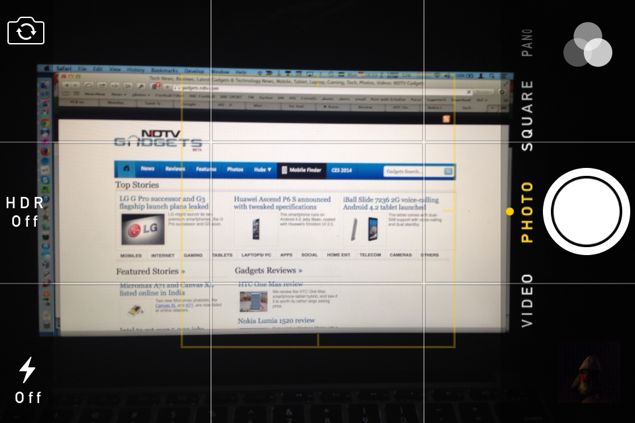
Photos app has been refreshed to now shows your content grouped by Years, Collections andMoments - automatic grouping of photos and videos based on time and place - that make it a little bit easier to discover stuff, especially as your library gets larger.
Performance/ Battery life
With almost identical hardware, it's no surprise that there is little to choose between the performance of iPhone 5 and iPhone 5c. However, if you are upgrading from an iPhone 4S or an earlier model, everything - from switching between apps, to how quickly the webpages load, and more - will seem significantly faster. Overall, though it runs 'only' a dual-core processor (as does the iPhone 5s for that matter), the iPhone 5c is more than a match for its quad- and octa-core rivals in terms of real world performance.
iPhone 5c comes with support for AirDrop, which is Apple's answer to Wi-Fi direct. Invoked via the Control Center, AirDrop lets you share photos, videos, contacts with other AirDrop users nearby over Wi-Fi and Bluetooth (even if you are not connected to a Wi-Fi network). We wish able had included Wi-Fi 802.11ac in the 5c, and indeed, the iPhone 5s.
Though the iPhone 5c (1507mAh) has only a slightly larger battery than the iPhone 5 (1440mAh), in our tests we found the iPhone 5c lasting significantly longer, likely due to optimisations that Apple has been able to introduce while developing the 5c alongside iOS 7. With brightness set to auto and 3G data on throughout, the phone easily lasted a day of heavy usage with around 20 percent juice to spare.
Verdict
While the iPhone 5c is a solid phone in its own right, with Apple choosing to release the 5s at the same time, comparisons between the two are inevitable, and that's where it becomes difficult to recommend the colourful iPhone over the flagship. When you spend north of Rs. 40,000 rupees, you expect to buy the latest and greatest that a company has to offer, and the iPhone 5c clearly doesn't deliver on that count. If you are considering the 5c as an option, we recommend you spend a little bit more money and buy the iPhone 5s instead.
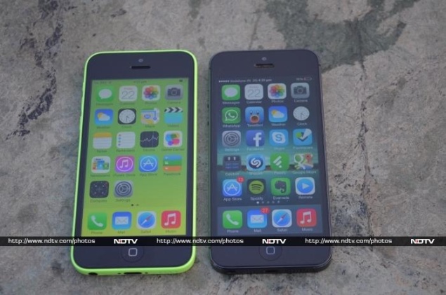
Of course some people may be on a fixed budget, in which case they can look at Android flagships at a similar price point like the Samsung Galaxy S4, HTC One and the LG G2. You get a bigger screen but phones that do not age as well as Apple's. Do remember that the flagships from Samsung and HTC are almost a year old at this point in time, and their successors are not too far away from being announced.
If you have an iPhone 5, you can safely skip the 5c because even though there are improvements, they are not enough to justify spending any more money. There's more than enough reason for users with older iPhone models to upgrade.
SOURCE- NDTV GADGETS

