Facebook unveils Paper, a Flipboard-style news reader app for iPhone
31/01/2014 12:45
Facebook unveils Paper, a Flipboard-style news reader app for iPhone:-
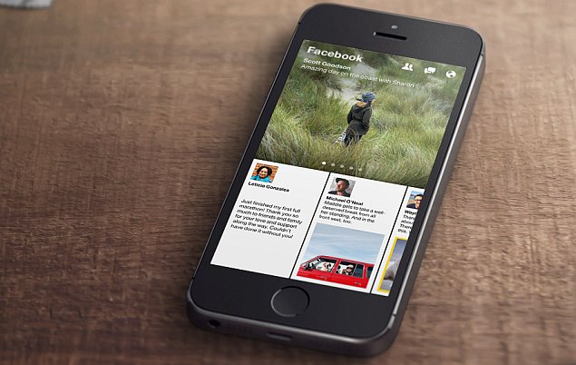
Facebook has announced the launch of its first news reader app, called Paper. It will be available for the iPhone in the US on February 3. Facebook says Paper is the first product from the Facebook Creative Labs, where it claims to be "crafting new apps to support the diverse ways people want to connect and share."
The social networking giant had been rumoured to be readying the app earlier in January, and the unveiled app is exactly in line with earlier expectations, featuring a Flipboard-style layout.
The newly-unveiled Paper is also the first of the new standalone apps from Facebook, new products in the vein of Messenger and Instagram that CEO Zuckerberg hinted at during Wednesday's earnings call - a Facebook Groups app is also expected.
The Facebook Paper app in many ways can replace the regular Facebook app, as it allows users to browse and interact with posts/ stories from their News Feed - the primary function of the regular app - in a brand new 'immersive design and fullscreen, distraction-free layout'. While all the functions of the main app aren't present, Paper's layout is certainly an attractive, high-bandwidth alternative.
 The 'distraction-free layout' also has us wondering just where Facebook will sticks ads into the application, as without them, it would losing a platform for mobile advertising, which currently bringsmore than 50 percent of its advertising revenue.
You might be wondering why Facebook Paper is called a standalone news reader app, if all it shows are stories from the user's News Feed. Well, it's being called one because it also shows curated news and feature content in themed sections to users.
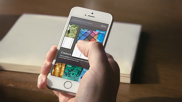
Themes and topics include more than a dozen choices initially, such as photography, sports, food, science and design. Content in these sections is chosen by Facebook editors from new as well-established publications. Detailed covers will apparently make it easier to spot preferred sources. Users at this point will not be able to add their own sources.
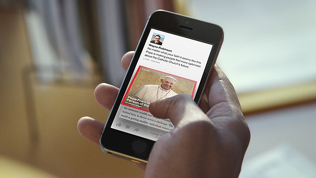 Coming back to the interface of Paper, Facebook is touting intuitive controls, allowing users to easily browse stories with 'natural movements'. The company says users will also be able pan-through high-resolution panoramic photos by simply tilting the phone. Fullscreen autoplay videos will apparently also aid in the immersive experience.
The social networking giant had been rumoured to be readying the app earlier in January, and the unveiled app is exactly in line with earlier expectations, featuring a Flipboard-style layout.
The newly-unveiled Paper is also the first of the new standalone apps from Facebook, new products in the vein of Messenger and Instagram that CEO Zuckerberg hinted at during Wednesday's earnings call - a Facebook Groups app is also expected.
The Facebook Paper app in many ways can replace the regular Facebook app, as it allows users to browse and interact with posts/ stories from their News Feed - the primary function of the regular app - in a brand new 'immersive design and fullscreen, distraction-free layout'. While all the functions of the main app aren't present, Paper's layout is certainly an attractive, high-bandwidth alternative.
 The 'distraction-free layout' also has us wondering just where Facebook will sticks ads into the application, as without them, it would losing a platform for mobile advertising, which currently bringsmore than 50 percent of its advertising revenue.
You might be wondering why Facebook Paper is called a standalone news reader app, if all it shows are stories from the user's News Feed. Well, it's being called one because it also shows curated news and feature content in themed sections to users.
Themes and topics include more than a dozen choices initially, such as photography, sports, food, science and design. Content in these sections is chosen by Facebook editors from new as well-established publications. Detailed covers will apparently make it easier to spot preferred sources. Users at this point will not be able to add their own sources.
 Coming back to the interface of Paper, Facebook is touting intuitive controls, allowing users to easily browse stories with 'natural movements'. The company says users will also be able pan-through high-resolution panoramic photos by simply tilting the phone. Fullscreen autoplay videos will apparently also aid in the immersive experience.

